Lucid Stitch
Lucid Stitch is a consignment shop brand selling second hand clothing. This retail store is located in Gettysburg, Pennsylvania. Previously the store was known as 22(9) Wares, but recently decided to rebrand as Lucid Stitch to appeal to a broader consumer base. The clothing currently being sold are all vintage from previous decades ranging in different sizes and styles.
Lucid Stitch is influenced by fashion and trends from the 70’s. The store uses bold colors in their signage, packaging, illustrations, website and advertisements. The illustrative style references iconic clothing and imagery from the 70’s. Lucid Stitch wanted to re-envision decade old trends into modern styles for their brand identity.
Project Scope
The fashion industry currently contributes to 10% of all greenhouse gas emissions. Just from production alone, companies such as Levi Strauss, create immense amounts of carbon dioxide when creating their jeans. According to Christine Ro in Can fashion ever be sustainable?, “Levi Strauss estimates that a pair of its iconic 501 jeans will produce the equivalent of 33.4kg of carbon dioxide equivalent across its entire lifespan – about the same as driving 69 miles in the average US car.” The textiles industry has also been identified in recent years as a major contributor to plastics entering the ocean. Buying second hand clothing is a great alternative to this current epidemic of fashion waste. Repurposing already made clothes for use again is a form to combat the current waste being produced from textile production. To encourage people to buy second hand, a store is designed that people would be accepting towards without the stigma that buying second hand is dirty or cheap. This project entitles rebranding a Vintage Boutique, previously known as 22(9) Wares, into a more cohesive engaging brand. A vintage boutique is a store that sells second hand clothing from previous decades. This project focuses on the store's environmental appearance inside the location as well as improving their online presence.
The store will be renamed to Lucid Stitch, a name that is more catchy and recognizable than the previous. The new brand identity will distinguish Lucid Stitch apart from similar stores. The previous brand was boring and lacked personality for their customers to relate to. The new style will relate more to the consumer base using abstract illustrations as well as bold colors. The website will be better curated to retain internet traffic longer than it already has by including more organized pages with keyword descriptors. The packaging and signage will reflect the brand's new personality.
Ro, Christine. “Can Fashion Ever Be Sustainable?” BBC Future, BBC, 10 Mar. 2020, https://www.bbc.com/future/article/20200310-sustainable-fashion-how-to-buy-clothes-good-for-the-climate.
Deliverables
Lucid Stitch Logo
Full Website
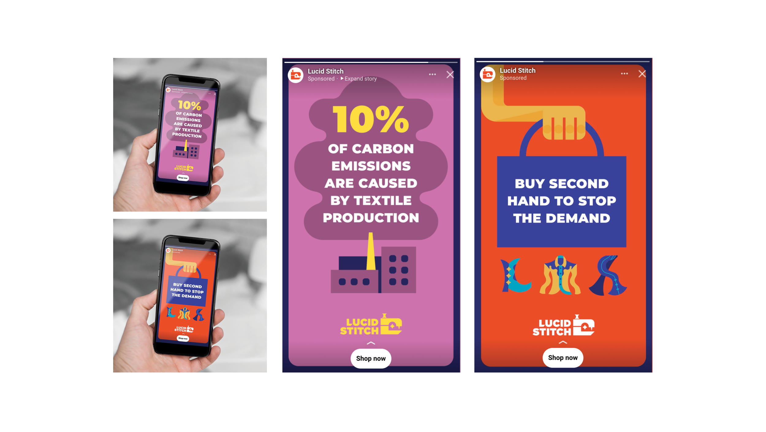
3 Social Media Ads
Instagram
Facebook
Twitter
Environmental Signage
Window Sign
Clothing Category Signs
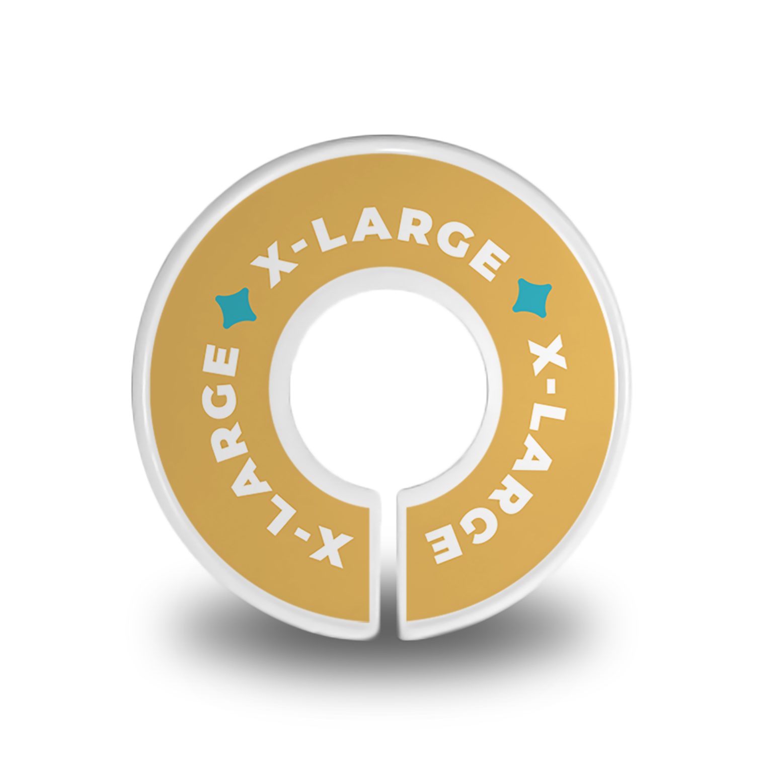
Size Dividers
Wall Mural
Dressing Room Sign
Packaging
Clothing Tags
Clothing Label
Shopping Bag
Tissue Paper
Objectives
To independently research, design, and produce a logo, fully functioning website, three social media advertisements, environmental store signage, and packaging pieces for Lucid Stitch.
To thoroughly research and interpret how a functioning store brand effectively uses environmental, package, and UI/UX design. Also to research how the textile production industry affects the environment for social media advertisements.
To create a brand identity using abstract illustrations and bold colors to appeal to the consumer base.
To apply knowledge and skill of design through photography, layout, illustration, typography, and environmental design.
To organize a plan that manages time dedicated to be spent on working for Lucid Stitch.
To analyze critique given from professors and peers and apply when suggestions are key for improving design.
To produce a cohesive brand design for all elements while also keeping elements functional for use.
Target Demographic
The targeted demographic will focus on young adult women, age range of 16-37. According to Statista’s statistics of Share of consumers willing to buy secondhand apparel worldwide as of 2021, by age, “42% of 18 - 24 year olds and 42% of 25 - 37 year olds are willing to buy second hand apparel.” The brand's style and use of social media advertisements would best be effective for this respective demographic range.
Smith, P. “Consumer Willingness to Buy Secondhand Apparel by Age Worldwide 2021.” Statista, 22 Mar. 2022, https://www.statista.com/statistics/828034/willingness-to-buy-secondhand-items-by-age-worldwide/.
Research
For rebranding 22(9) Wares into Lucid Stitch, I first researched what curated consignment shops initially were and how they operated. I also researched similar competitors to the current 22(9) Wares store as well as conventional retail stores. Looking at small local shops and larger popular retailers, such as ModCloth or Target, gave me a better idea at how environmental, packaging, and UI/UX design operates in those spaces. Online articles on sustainability and retail design also helped aid in the research process.
Researching articles on the fashion industry’s climate change effects helped me better understand the cause for buying second hand clothing. This information also gives Lucid Stitch production pollution facts for their social media advertisements. Knowing that there are very accessible ways to help preserve our planet and life on it, gives me a better appreciation for the people who take their time out of their day to not only preserve history, but help stop the demand that causes this environmental damage.
Moodboard
Process
The first step to designing this project was creating a mood board, a collection of images I drew inspiration from for designing Lucid Stitch. These images drew from the idea of surrealism and 70’s iconography. The idea of this 70’s surrealism was a reference to the brand name “Lucid.” The name lucid is not to be taken for the exact word but an allusion to the phenomenon of lucid dreaming, hence the dream-like surrealist inspiration.
The logo went through many renditions alluding to the idea of lucid dreaming, ultimately ending up at an abstracted sewing machine with a star in the center. The star recalls back to the idea of dreaming from the connection of night time being when a person dreams but also sees stars.
The illustrations were heavily based off the iconography of the 70’s with depictions of bell-bottoms and so on. The graphics use bold colors and abstracted forms to create a unique perspective. These illustrations are used on the website, environmental signage, social media ads, and packaging. The use of the graphics makes Lucid Stitch unique and appealing to their consumer base.
Logo Process
Illustration Process
Environmental Signage
The environmental signage consisted of a window sign, mural, dressing room sign, category signs, and size dividers. These signs incorporate the logo and illustrations from Lucid Stitch. These environmental pieces would be seen inside the store guiding customers to products they are looking for and reinforcing the store’s brand.
Packaging
The packaging elements included designing tissue paper, clothing tags, shopping bag, and a clothing label. These elements purpose to protect customer’s purchases while also showing brand identity. Having information accessible to customers such as size and price information is important for easier shopping navigation.
Social Media Advertisements
The use of social media is to promote the store to a broader range of potential consumers. The advertisements each have a call for action to shop second hand while giving facts of how the current fashion industry causes climate change. The advertisements use the bold, colorful illustrative style seen through the rest of the project.
Website
Lastly, the website was designed to be fully functional. The user experience was made easier by showing all products at the top of the page on the nave bar. All secondary information can be found at the footer. According to my research, most conventional retailer websites did not include secondary information other than the shopping feature in the navigation. The website allows users to freely find products they are looking for and create accounts.


